A CRO audit and rebuild of the InstallPros U.K. landing page.
A Starlink installer buying almost all of its traffic, with no way of seeing where it lost it. Two out of three visits never typed a thing.
- Role
- Product Designer
- Timeline
- 2026
- Scope
- Funnel audit, UX/UI, front-end & analytics
Part 01
Where the money went
A business buying all of its traffic, and unable to see it.
£19,000
monthly Google Ads spend
87%
of traffic bought, 5% organic
80%
of visits arriving on mobile
61 → 1
pages sharing one thank-you page
The ads worked: strong click-through, efficient cost per click. The problem started after the click, and nobody could say where. One thank-you page served 61 unrelated pages, so every conversion figure in the account was inflated.
Worse, the primary conversion was a WhatsApp click, so automated bidding went hunting for people who click WhatsApp links. It believed it was paying £5.61 a conversion while a real installation lead cost £10 to £22.
Part 02
The diagnosis
Two problems that are easy to mistake for one.
A funnel that under-delivers fails in two unrelated ways. The remedies have nothing in common, so the first job was to find out which one this was.
Hypothesis A
They start the form and give up partway through.
A form problem. Fixed by shortening it, splitting steps, rewriting fields.
Hypothesis B
They never start it at all.
A page problem. Fixed by what the first screen promises and asks for.
Every number the client held pointed at A.
Four sources, and the one contradiction between them

Heatmaps & scroll maps
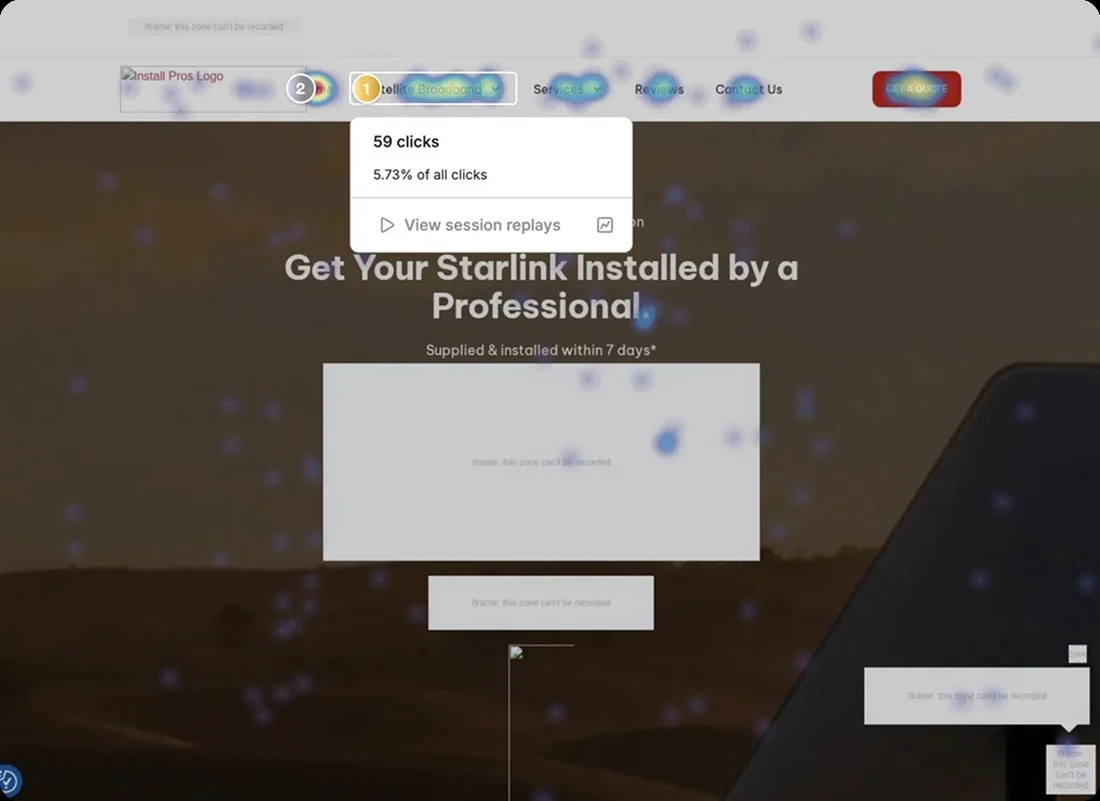
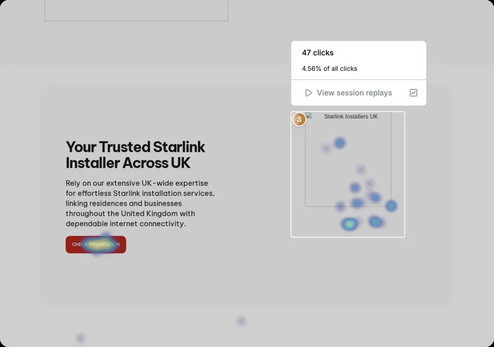
Mobile scroll died at 25% of the page. On desktop the two most-clicked elements were menu entries, and no conversion button made the top three.

Form analytics
Drop-off by question: 76% postcode, 16% phone, 5% name, 2% email. The only source that let me rebuild continuation field by field.

Web analytics
Mobile converted worse than desktop, 18% against 24%. The easy read was “fix the form on mobile”.
The cross-check · where it broke down
But mobile completed better than desktop once started. The gap wasn't inside the form. It was in getting anyone to touch it.
Exhibit A · drop-off by question
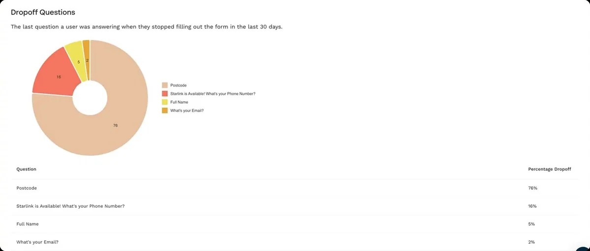
Exhibit B · click heatmap
The verdict
Hypothesis B
The leak was at the door, not inside the room.
The funnel, end to end
Landing page visits
100%
Start the form
33%
Complete it
32%
Qualified lead
~48%
Each bar is against the previous step. End to end, roughly 5 visits in every 100 become a qualified lead.
Completion, 32%, could be better. But two in three people leave before typing a character, and that is the step nobody was looking at. On mobile, where 80% of them arrive, the offer took 17.6 seconds to finish rendering.
Continuation, step by step
| Step | Reached | Continued |
|---|---|---|
| Postcode | ~12,300 | 49% |
| Phone | ~6,000 | 78% |
| Name | ~4,600 | 91% |
| ~4,200 | 96% |
The drop-off report put 76% of abandonment at the postcode, but abandonment always over-indexes the first step, because everybody passes through it. Continuation compares like with like: of those who reach a field, how many go on.
One step loses half the people. The three after it keep nearly everyone.
The two screens that explain it
The form showed one question per screen, and the tool records the last question answered, so that 49% covers two moments the data can't separate: abandoning while typing the postcode, and handing it over only to leave on the next screen. Both are explained by the same pair of screens.
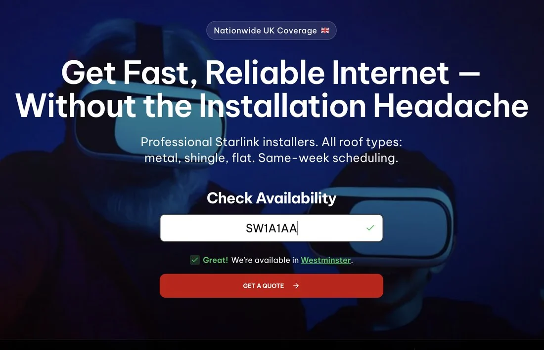
Before · screen 1 · postcode

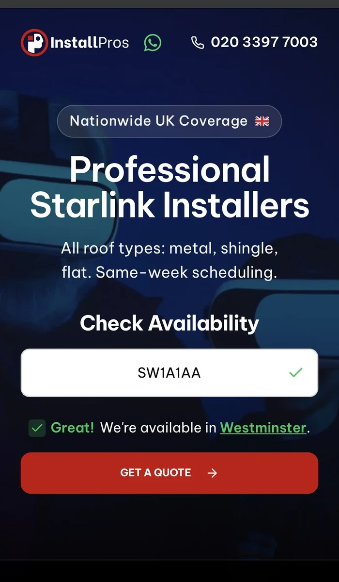
- 1“This allows us to check availability in your area.” A promise of a check.
- 2A thin line over a photo: no box, no format example.
- 3An unlabelled arrow. Nothing says what pressing it does.
Before · screen 2 · phone

- 4The answer takes the slot where “Postcode” used to be. Fixed text, identical for every postcode.
- 5The phone number, asked for in the same breath.
- 6The warning that they'll call you, a second time.
The user hands over the data that costs them little, receives an answer that doesn't answer their question, and is asked in the same movement for the data that costs them a lot. It wasn't the length of the form. It was the exchange.
Part 03
The answer
Six decisions, each one traceable to a number.
The form itself lives inside a third-party iframe: unmeasurable field by field, and incapable of looking anything up. So the first step could only be rebuilt somewhere else: a landing page of my own, design, front-end and deployment.
01
Separate the answer from the request
Postcode, then the answer with the real district name as a screen of its own, then the contact details. Half the people who gave a postcode went no further.
02
Change what the button promises
From “Get a quote” to “Check if we cover your area”. A quote sounds like a sales call; a check is a query. It lowers the cost of the first click.
03
One call-to-action label
Four different texts for the same button. Four labels split the clicks between options that are the same thing.
04
Minimal navigation on the landing
Logo and phone number; the 40-plus-link menu is gone. Two menu entries were among the five most-clicked elements. On mobile the menu beat the primary button.
05
Trust signals above the fold
Ratings and press credentials moved into the first two screenfuls on mobile. The bottom 75% of the page was never seen on mobile, and the proof lived down there, invisible to 80% of the traffic.
06
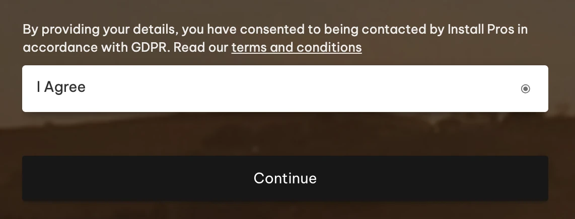
Consent, unbundled
One mandatory pre-ticked box covering contact and terms at once. Consent that is pre-ticked, bundled and compulsory is not valid consent, and the call it asked about needed none.
Heatmap · desktop
The same question, answered a different way.
Four comparisons on the same axis: the existing quote page on WordPress on the left, the landing I designed and built on the right.
Before · the iframe form
Fig. 01
After · my landing
Fig. 02
Before · mobile
Fig. 03

After · mobile
Fig. 04
Before · consent
Fig. 05
After · final step
Fig. 06
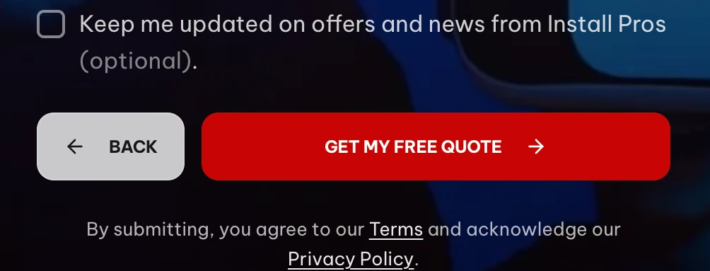
The ICO is unambiguous: consent needs a positive opt-in, so a pre-ticked box is not valid consent. But the tick was the smallest of three problems.
Bundled
Permission to contact and acceptance of the terms rode on the same tick. Consent has to be separate and granular; packaged with other terms it isn't valid.
Mandatory
You couldn't continue without it. Consent must be freely given, so making it a condition of the service invalidates it: friction and legal weakness at once.
Unnecessary
A call about this enquiry needs no consent, since the user requests it by submitting their number. Meanwhile future marketing, the one thing that does need an opt-in, was never separated out.
The map was already the third most-clicked thing on the page
It was not a button and it led nowhere, and they clicked it anyway. So the redesign gave that attention somewhere to go.
Before · the old map
Fig. 07
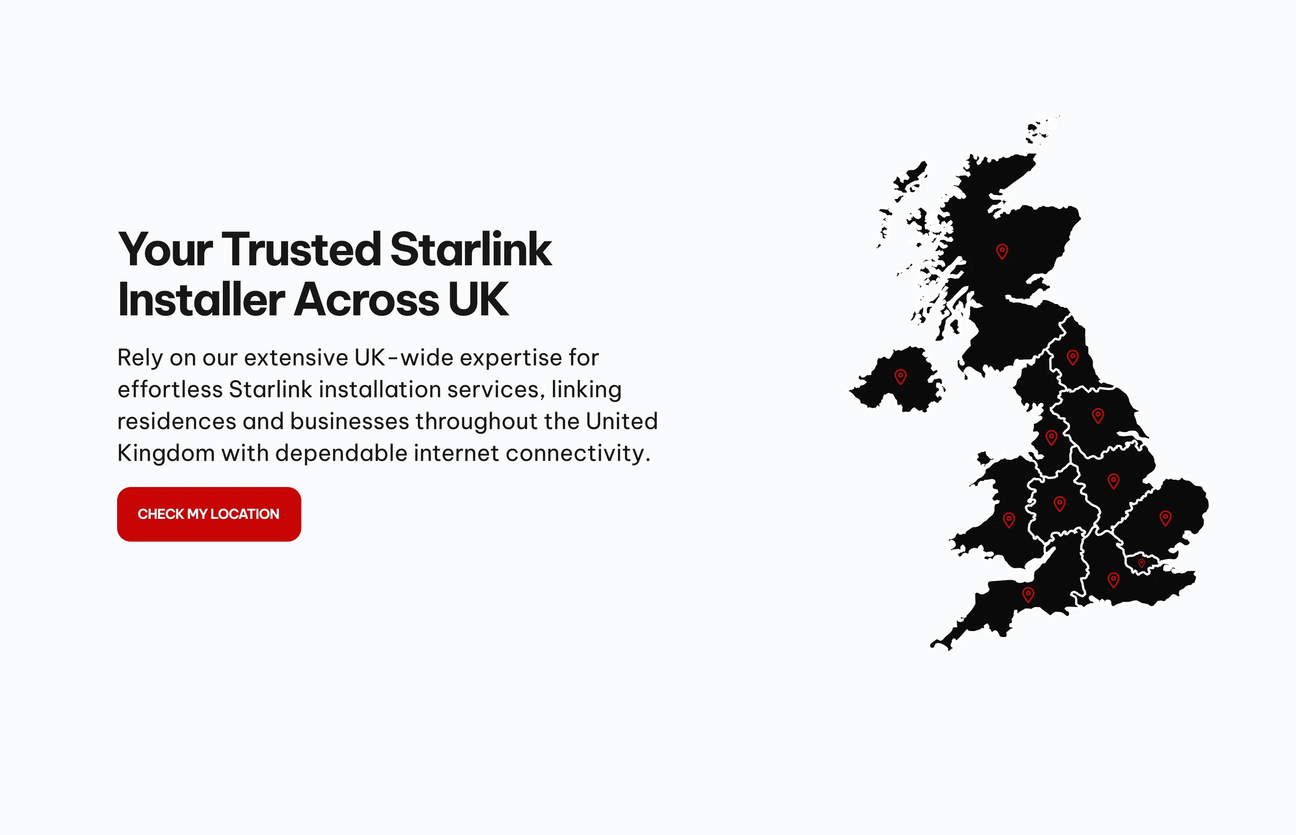
After · coverage
Fig. 08
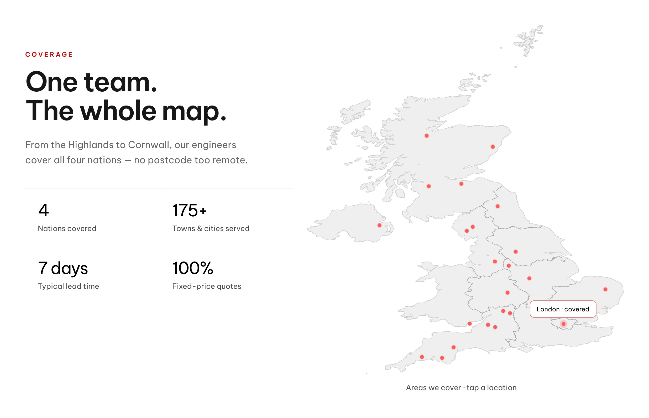
The cities aren't decorative
They come from analytics and the ads account: the places the traffic actually arrives from, not a spread of pins to make the country look covered.
London is highlighted on load
Most of the leads come from London, so the default state answers the question the majority of visitors arrive with before they touch anything.
Coverage was never the doubt
Satellite reaches everywhere. What the map has to prove isn't reach, it's that somebody works near you, which is what a named city does.
The second most-visited page on the site was a speed test with no way out
After · speed comparison
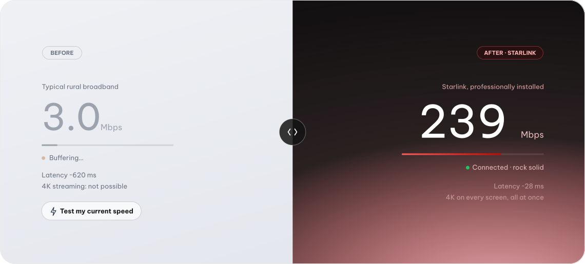
And 17.6 seconds before the offer finished rendering on mobile
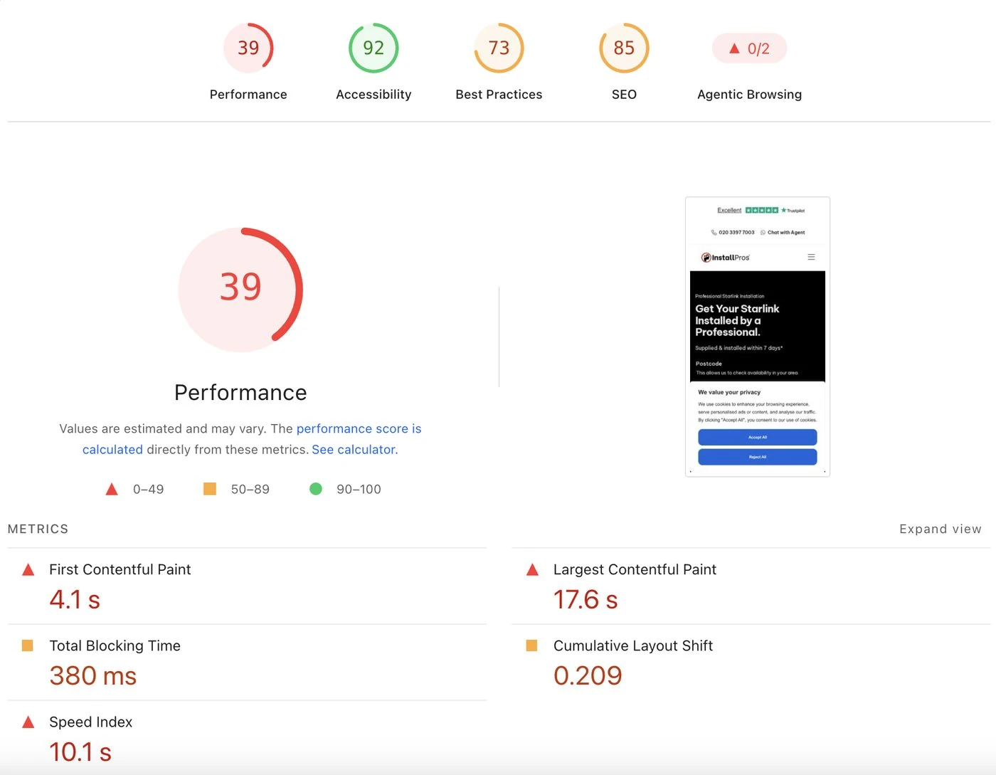
80% of the traffic arrives on mobile and nearly all of it is paid. The page those ads point at takes 17.6 seconds to finish rendering its offer; the new landing takes 3.3. Same route, same offer, same paid traffic, measured on both stacks.
PageSpeed Insights, mobile. Both runs on the quote page, same device class.
| What the visitor waits for | WordPress, in production | The new landing |
|---|---|---|
| Largest Contentful Paintthe offer finishes rendering | 17.6 s | 3.3 s |
| First Contentful Paintanything appears at all | 4.1 s | 1.1 s |
| Speed Indexhow fast the page fills in | 10.1 s | 2.4 s |
| Total Blocking Timetaps that do nothing | 380 ms | 10 ms |
| Cumulative Layout Shiftthings moving under your thumb | 0.209 | 0 |
Performance
3992
Accessibility
92100
Best practices
73100
SEO
85100
Before · mobile, score 39
Fig. 09
After · mobile, score 92
Fig. 10
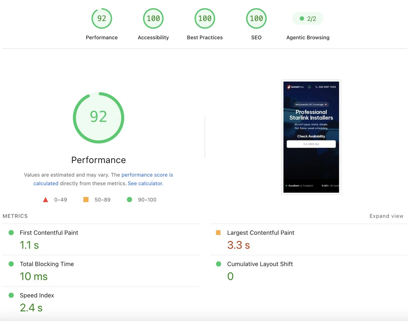
Speed is a barrier removed, not a conversion won. It changes how many people get to see the offer, not how many accept it.
Part 04
Scope and results
Every target cleared in the first week.
100+ published pages and a fixed budget, so the work stayed inside the existing WordPress template and was prioritised by impact over effort, rather than proposing the rebuild nobody had asked for.
It went live on a small share of paid traffic first, enough to tell whether it worked before moving the budget onto it. Seven days against the audit baseline:
| Metric | Baseline | Target | Actual |
|---|---|---|---|
| Form-start ratevisitors who touch the first field | 33.2% | 40.0% | 62.3% |
| Form completionleads ÷ form starts | 32.3% | 32.3%, hold | 48.5% |
| Visitor → leadthe headline number | 10.7% | 12.9% | 30.2% |
| Mobile visitor → leadclosing half the gap to desktop | 18.0% | 21.0% | 28.0% |
Visitor to lead nearly tripled in the first week, from 10.7% to 30.2%. The step that moved most is the one the diagnosis pointed at: two out of three visits used to leave without typing a character, and it is closer to two in five now.
Next project
EmmviFigures rounded. The analytics screenshots come from the client's accounts and are shown with their knowledge.