AgencyHub
A marketplace where the person who buys is not the person who pays. Product design, end to end: research, flows, information architecture, UI and component system. Single designer.
- Role
- UX/UI Designer
- Timeline
- 2020 - 2024
- Scope
- Marketplace, checkout, orders, provider tools
The Challenge
Agencies grow by saying yes, and every yes is a risk they absorb alone.
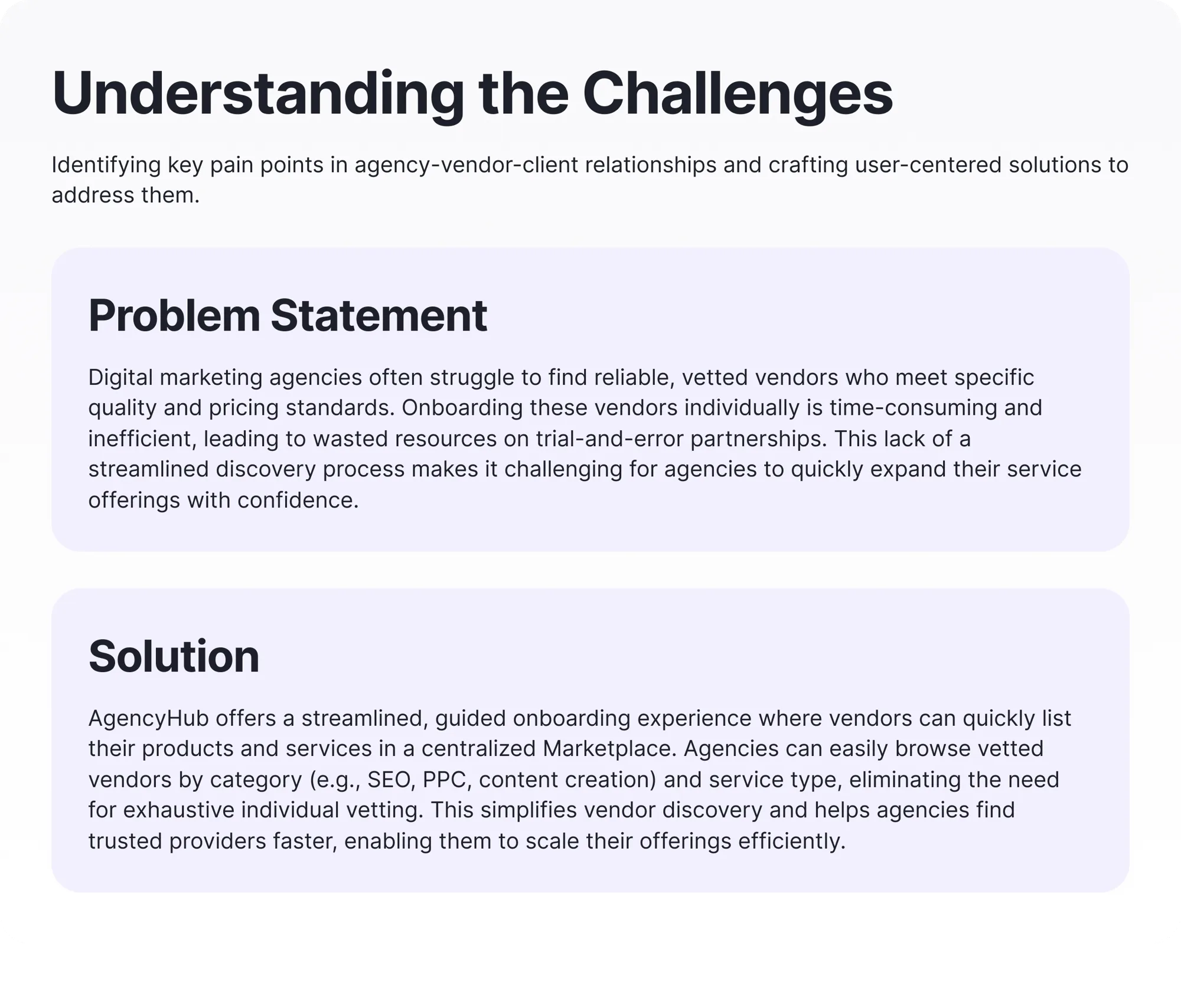
Digital agencies grow by saying yes. When a client asks for SEO and the agency only does ads, the agency either hires, refuses, or finds a white-label partner. Most choose partners, and most find them by trial and error. Every failed partnership costs money twice: the wasted spend, and the client who leaves.
AgencyHub's bet was that vetting could be a platform feature instead of a private struggle. For that to work, the product had to serve two sides with opposite needs: providers want to list fast, agencies want to trust what they find.
Trust is the product
The entire value proposition is that agencies stop vetting vendors themselves. Every catalog and listing decision had to defend that promise, even at the cost of growth.
Three parties, one transaction
Payment can come from someone who isn't the buyer and never logs in. Orders, notifications, and checkout all inherit that complexity.
One designer, four surfaces
Marketplace, cart, orders, and provider tools had to ship together, which made a shared component system a necessity, not a preference.
Why: what problem are we solving?
Before drawing anything: does this product deserve to exist?
Every project starts with the same discipline: write the problem down until it stops being vague. If the problem statement can't name who loses money and why, the design that follows is decoration.
Who: who are we designing for?
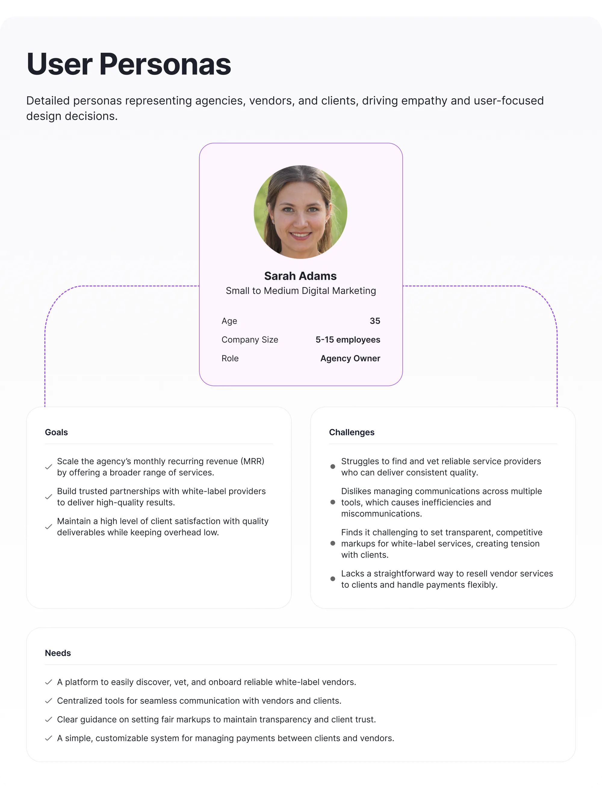
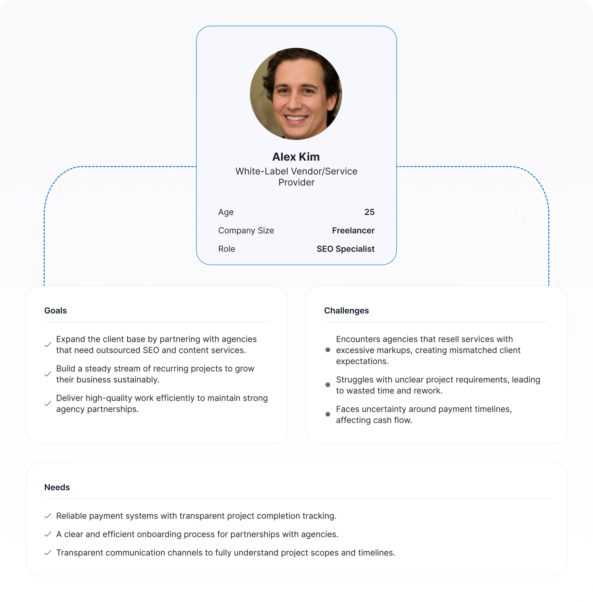
Two users with opposite incentives, and a third party who never logs in.
Personas here weren't a formality. The agency owner and the service provider want contradictory things from the same catalog: speed to list versus confidence in what's listed. Naming that tension early is what made the later trade-offs decidable.
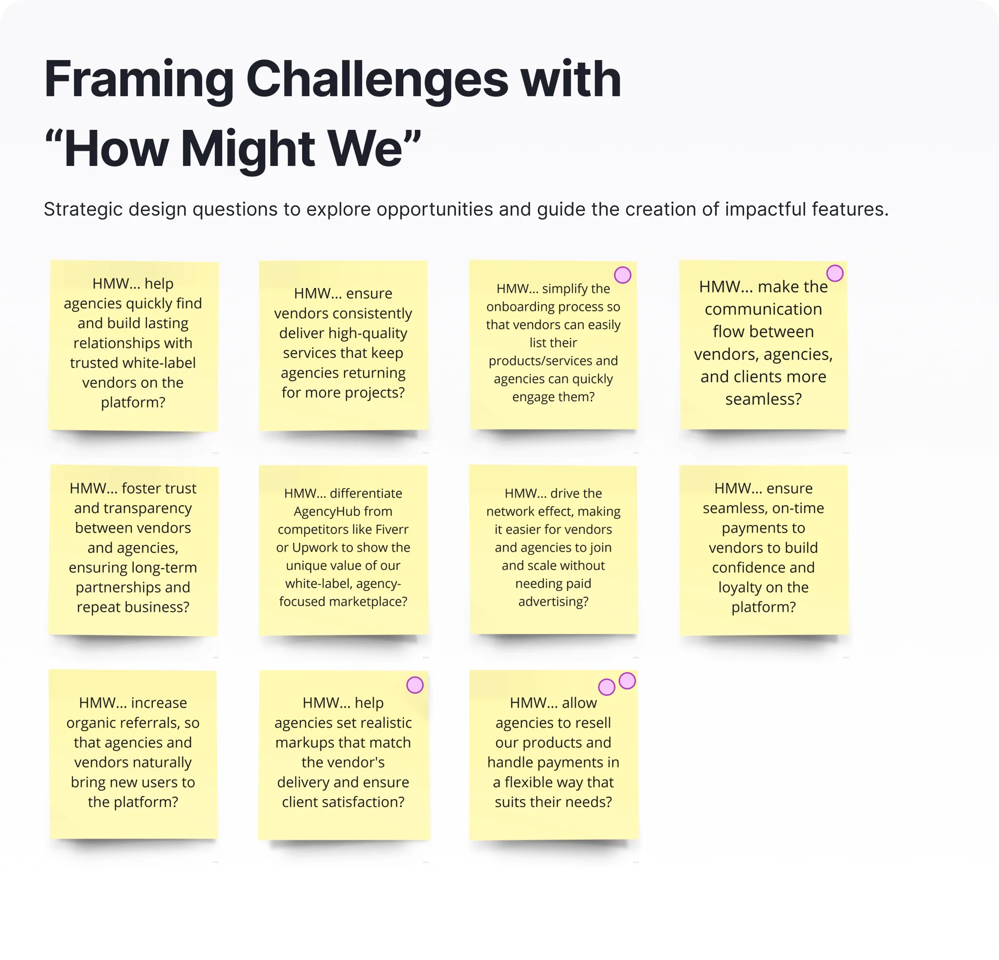
Reframe: how might we make trust a feature?
Turning the challenge into questions the team could design against.
How Might We notes convert complaints into briefs. The useful ones aren't the obvious ones: 'HMW make vetting a platform feature' reframed trust from a support cost into the core product.
When & Where: where does the money actually move?
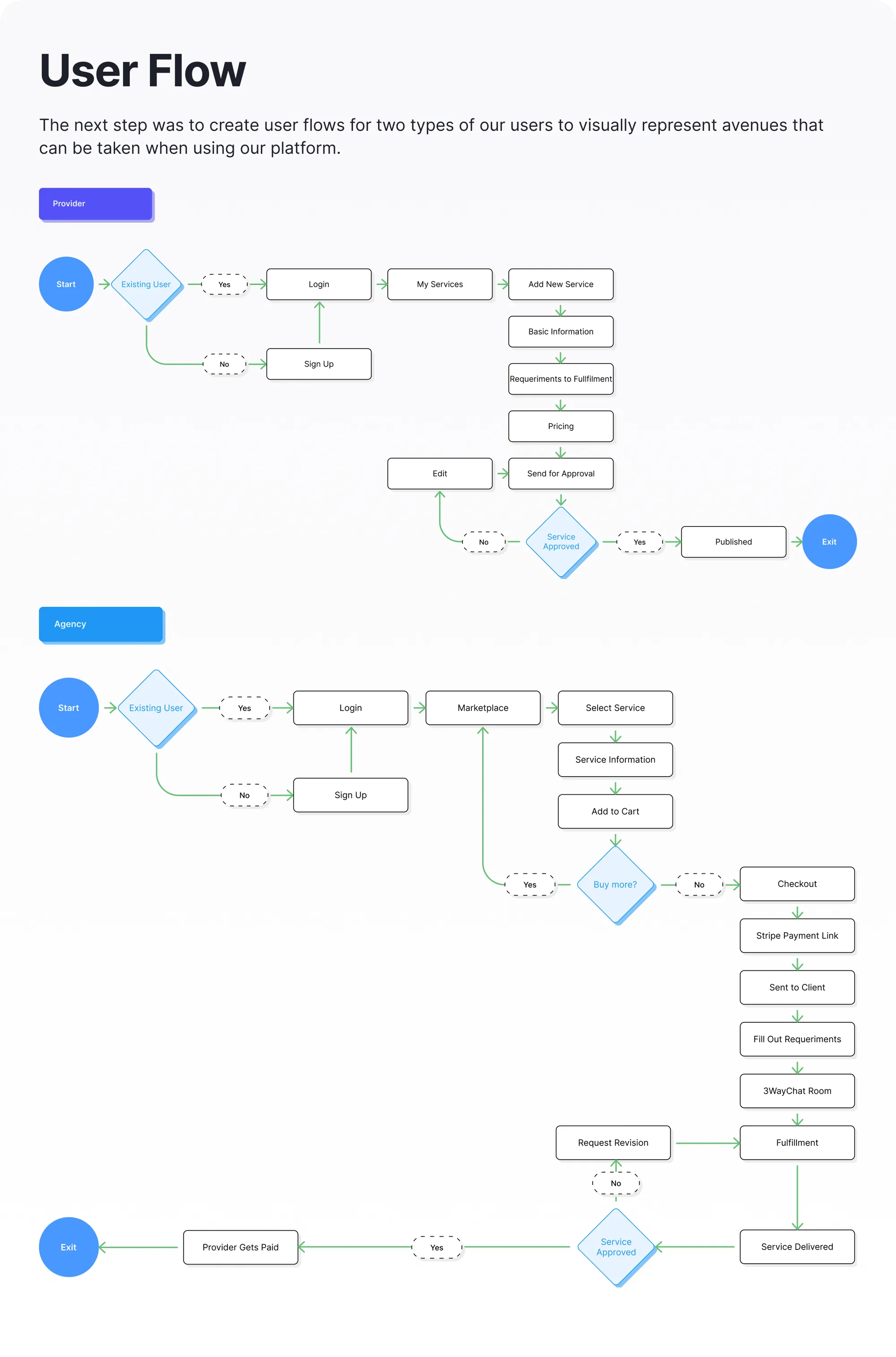
Mapping the journey exposed the flow nobody had scoped.
Walking both sides of the transaction end to end surfaced the design problem that shaped everything after: the agency buys, but its client often pays. The user flow made that detour visible before a single screen existed.
An agency often cannot pay until its own client pays them first. That client has no account and never enters the platform, yet puts up the money, supplies the requirements and judges the result.
| Actor | In the app | What they do |
|---|---|---|
| Provider | Yes | Lists, delivers, gets paid |
| Agency | Yes | Buys, sets the price, resells |
| End client | No | Pays, supplies requirements, approves |
Every screen had to answer one question: what happens when the person paying is not the person looking?
What: why isn't an existing marketplace enough?
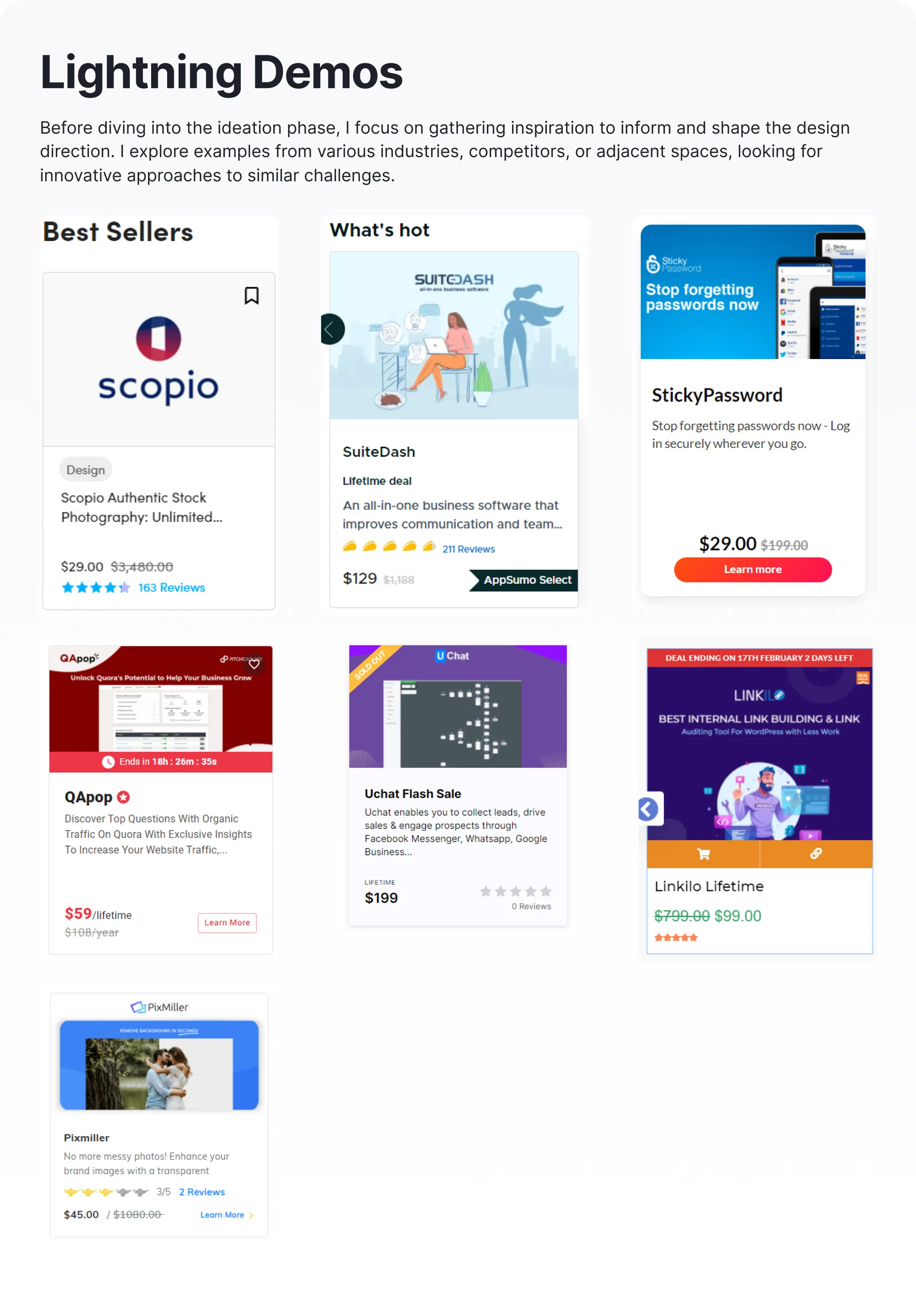
Studying what exists before deciding what to build.
Lightning demos are cheap due diligence: an hour of looking at how Fiverr, Upwork, and vertical marketplaces solve listing, trust, and checkout, then being honest about why none of them fit a reseller triangle.
Solve: what's the fewest screens that support the work?
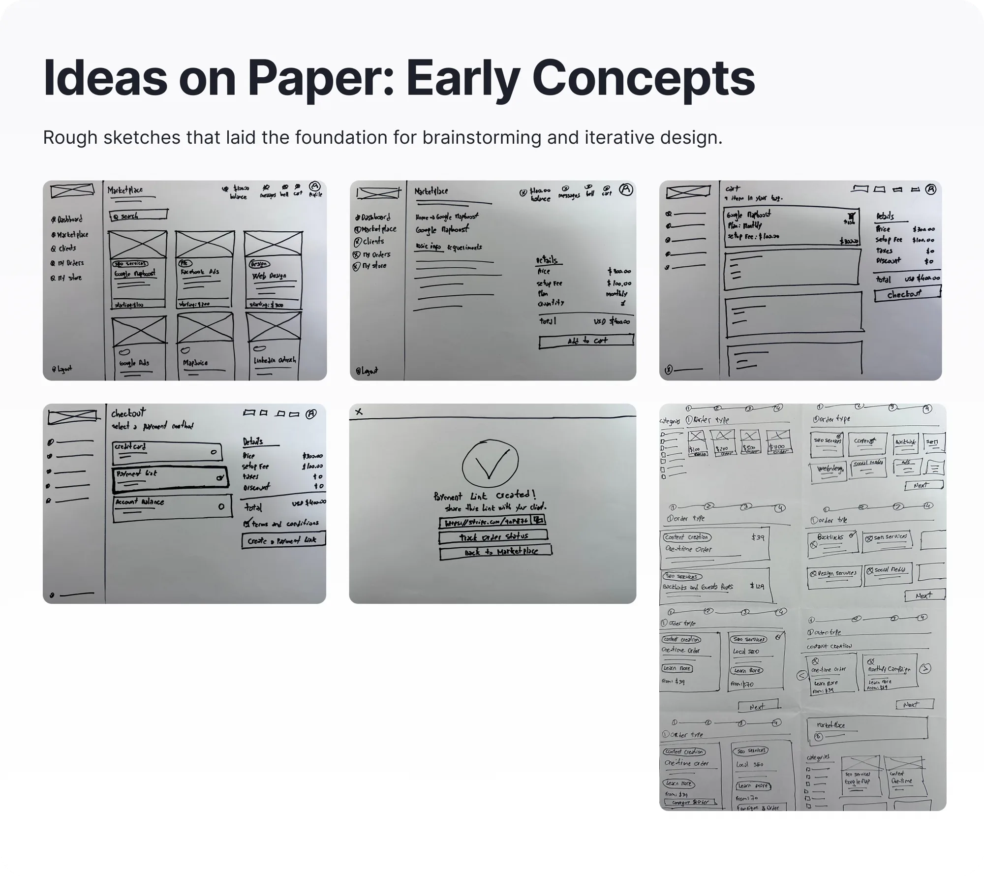
Paper first. Fidelity is earned, not assumed.
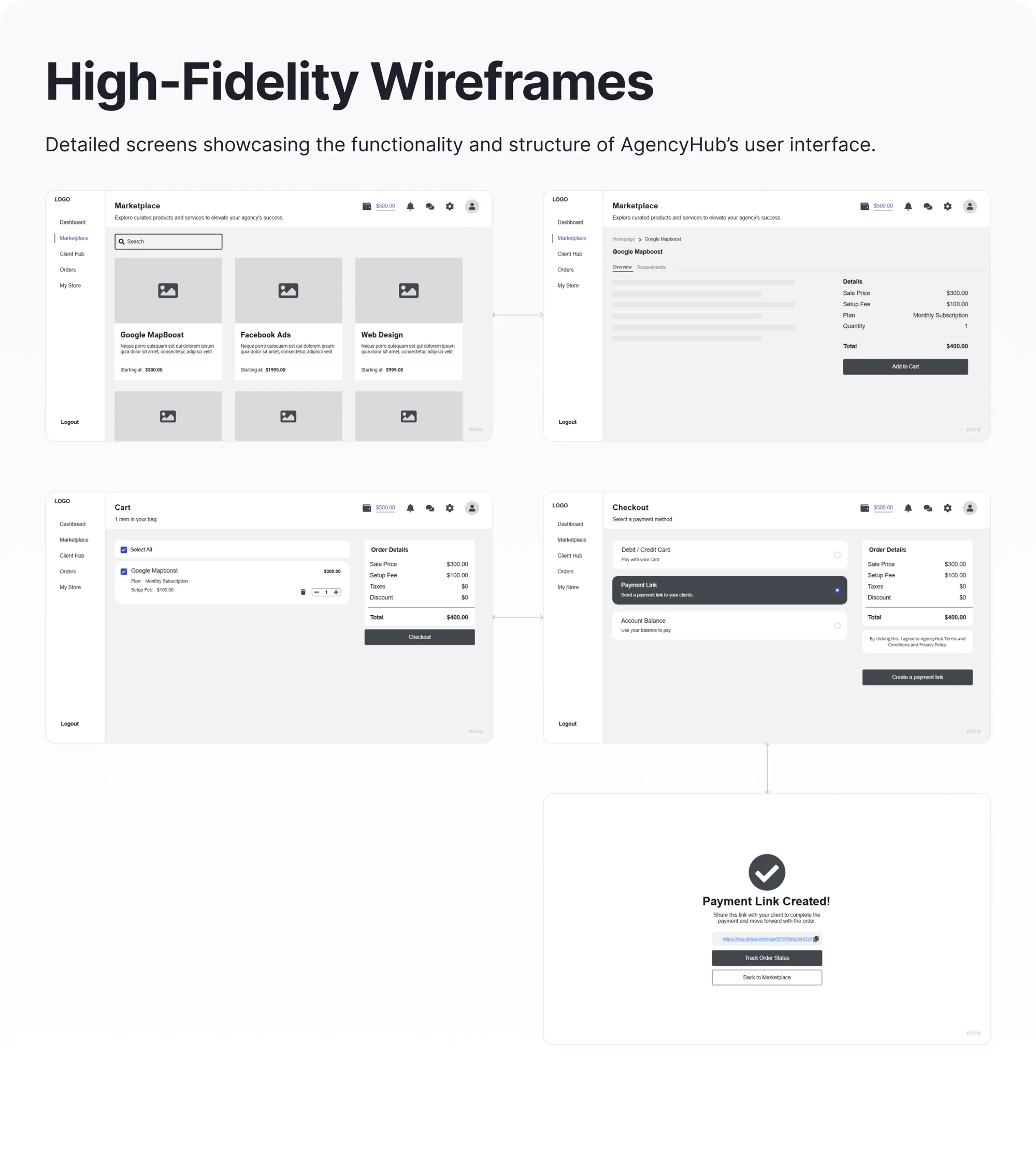
Fast sketches are where bad ideas get to die cheaply. Marketplace, cart, and checkout were sketched on paper, argued over, and only the survivors were rebuilt as high-fidelity wireframes.
Decision
The checkout has two endings, not three payment methods.
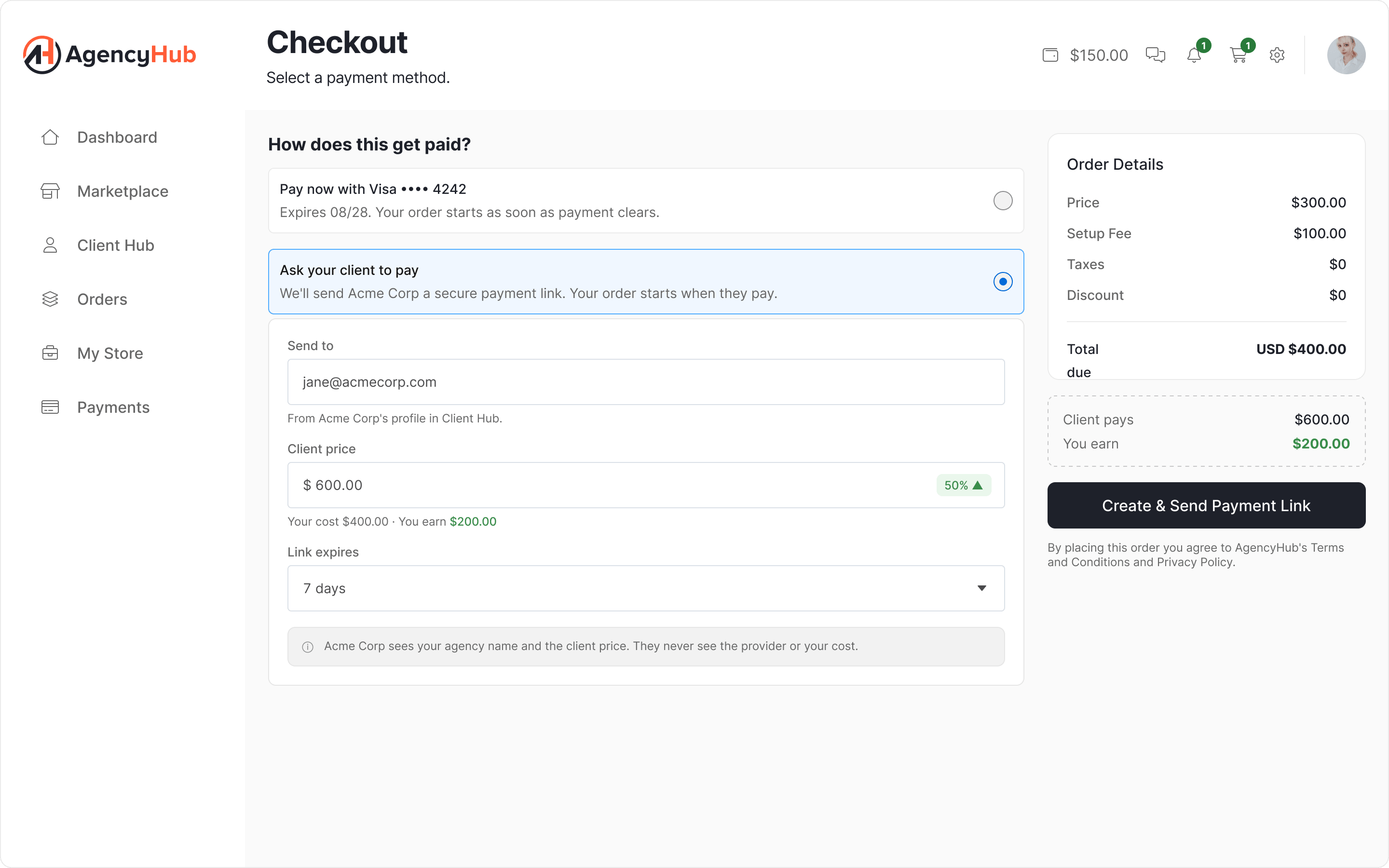
A checkout assumes the buyer pays. Here the agency often needs its client to pay first, so three payment options at the same level never held up: the payment link pays nothing and creates a waiting for client state, and the balance is a discount, not a method.
The shipped design has two outcomes, Pay now and Ask your client to pay, with the balance as a checkbox that comes off the total. The button changes with the outcome: Pay $250.00 or Create & Send Payment Link.
Decision
Each side sees its own price.
The agency needs margins it can defend. The provider needs its price protected from markups that break the client's expectations. Full transparency sounds honest, but it turns the agency into a middleman with a visible markup.
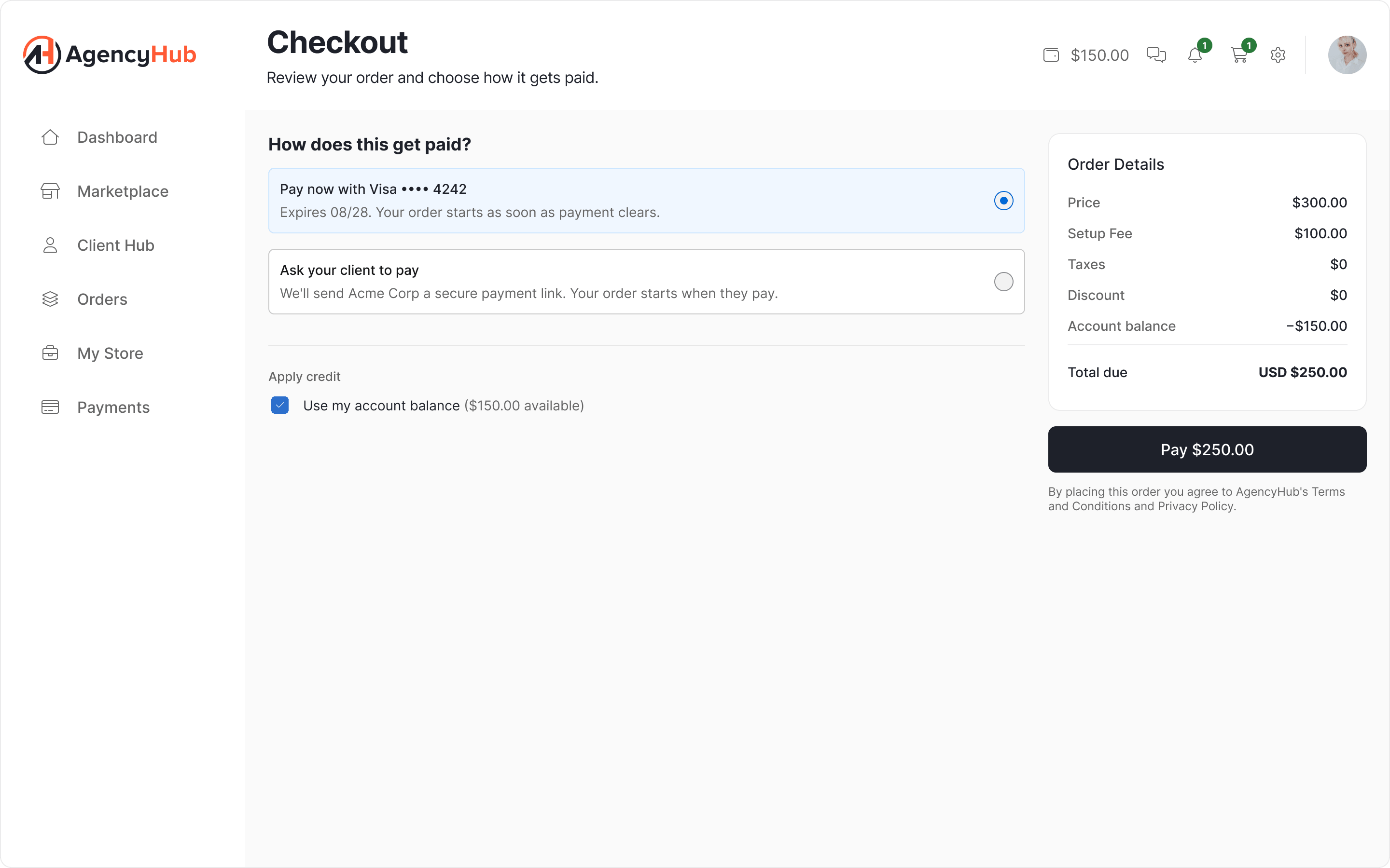
The provider never sees the client price. The client never sees the provider cost. The platform sees both, which is what lets it settle a dispute.
The margin lives inside the checkout: a Client price field with the markup calculated live, "Your cost $400.00 · You earn $200.00", plus a default markup in settings so pricing is not a decision made from scratch on every order.
Decision
One cart, one client.
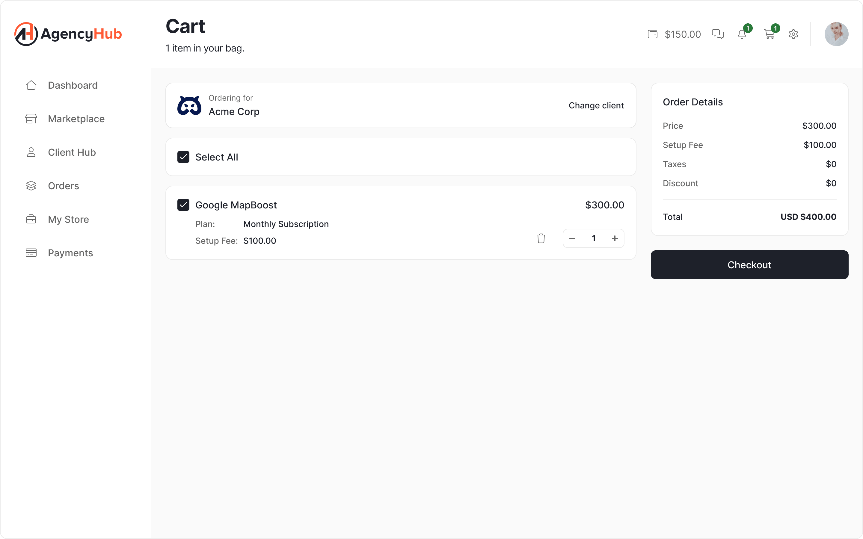
If the cart mixed SEO for client A with PPC for client B, the payment link would have no valid recipient: one link, one payer. So the cart is scoped to one client, chosen up front and visible throughout.
Buying for three clients means three orders: acceptable friction, because sending a payment link to the wrong person cannot be undone.
Decision
One room, two identities.
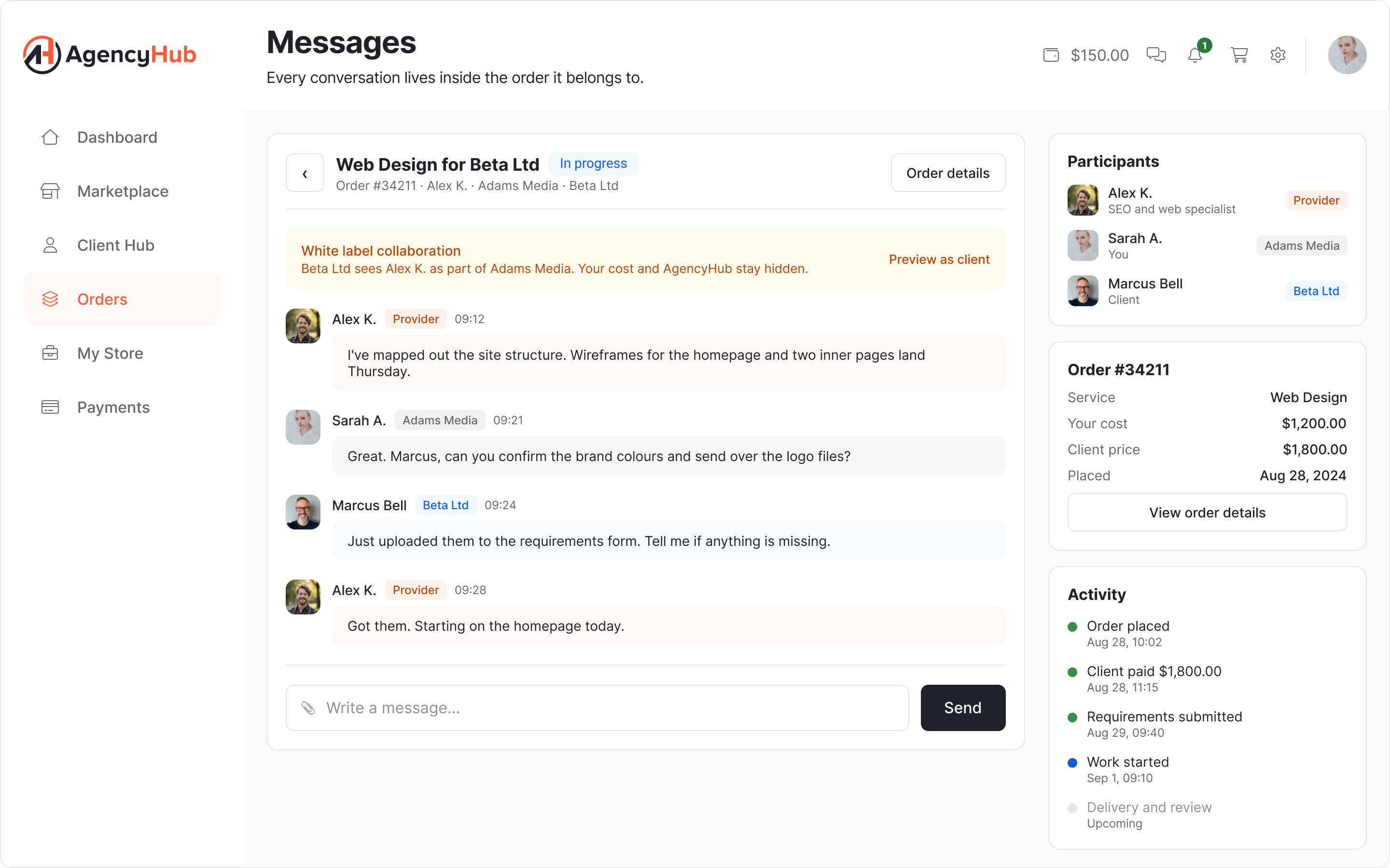
Communication lives in a space attached to the order. With three actors, the question is whether the client gets to see the provider. Yes, but as part of the agency's team: the platform does not hide the provider, it relabels them.
The agency is betting its client relationship on that relabelling, so it can preview the conversation exactly as its client sees it before writing anything sensitive.
The proof
The screen that proves all of it.
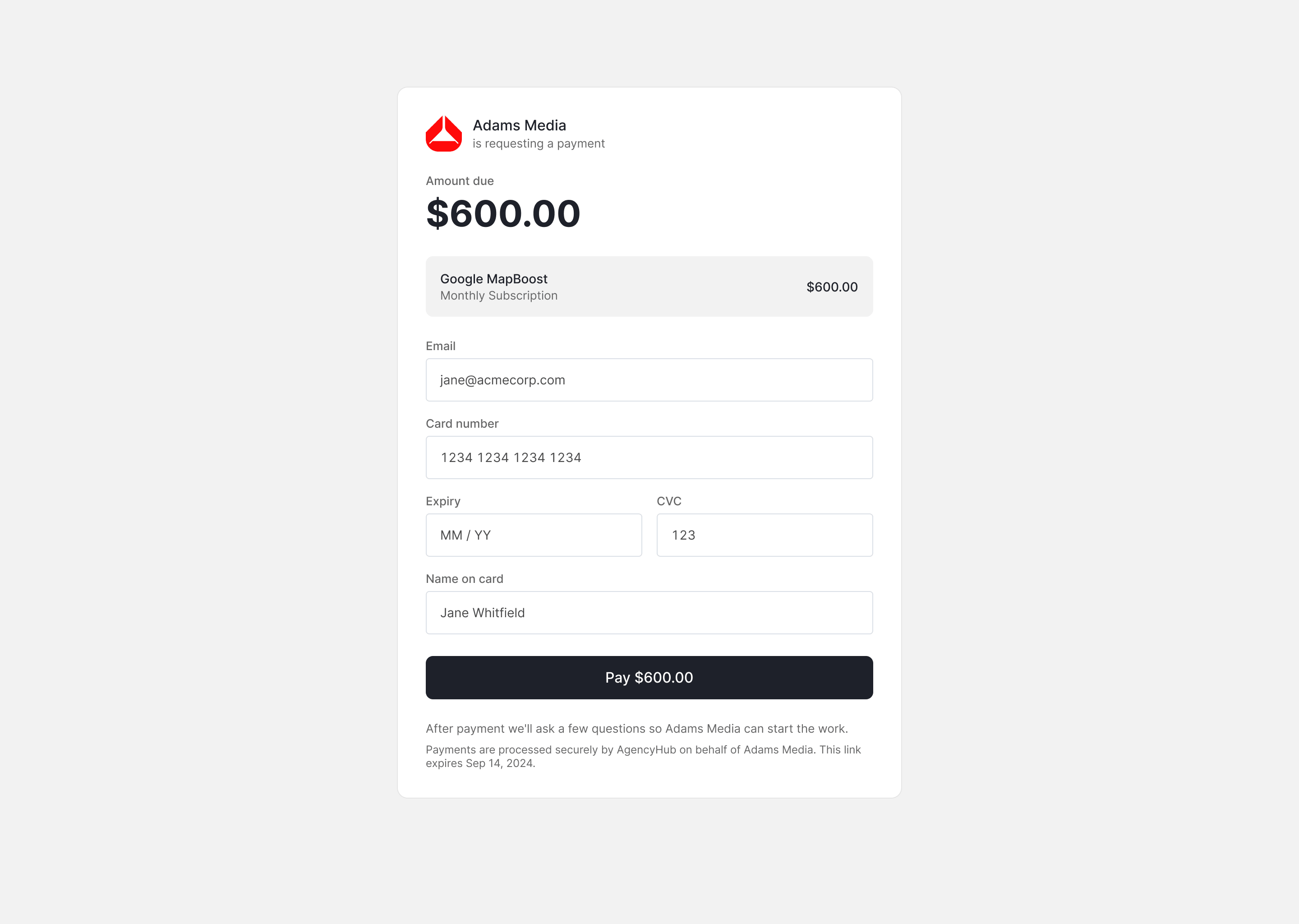
What the agency's client sees when they open the link: no account, no session, no idea what AgencyHub is.
- The agency's brand leads. No platform navigation or logo; AgencyHub appears only in the payment fine print, as the processor.
- $600.00 and no trace of the $400. No provider, no cost, no margin.
- "After payment we'll ask a few questions" turns silence into an expectation for a client with no dashboard to check.
- The expiry date is visible, the same one the agency picked earlier.
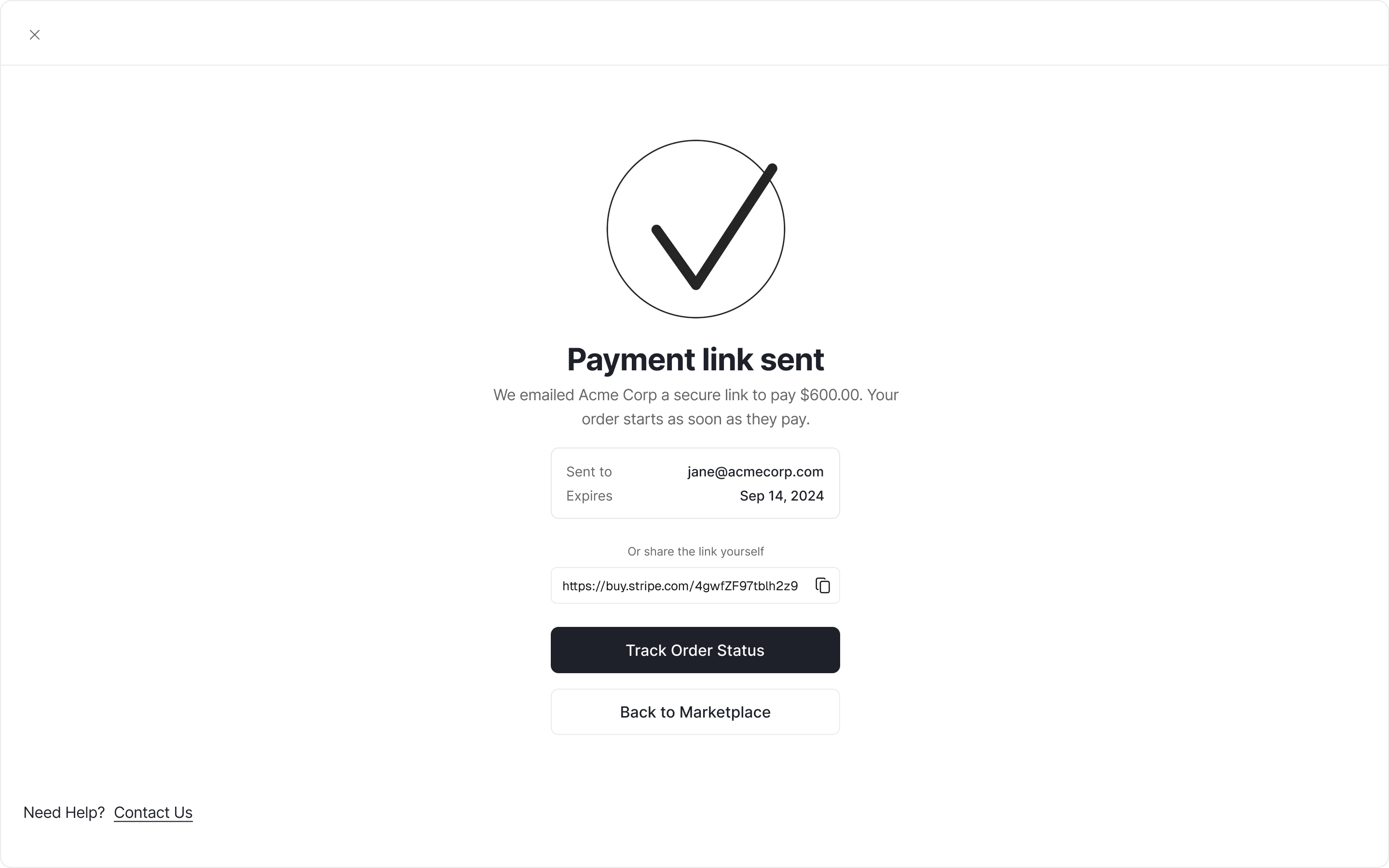
An expired link is not a dead end: Request a new link notifies the agency inside the platform, instead of pushing the conversation to email, where the platform cannot arbitrate.
States
States before happy paths.
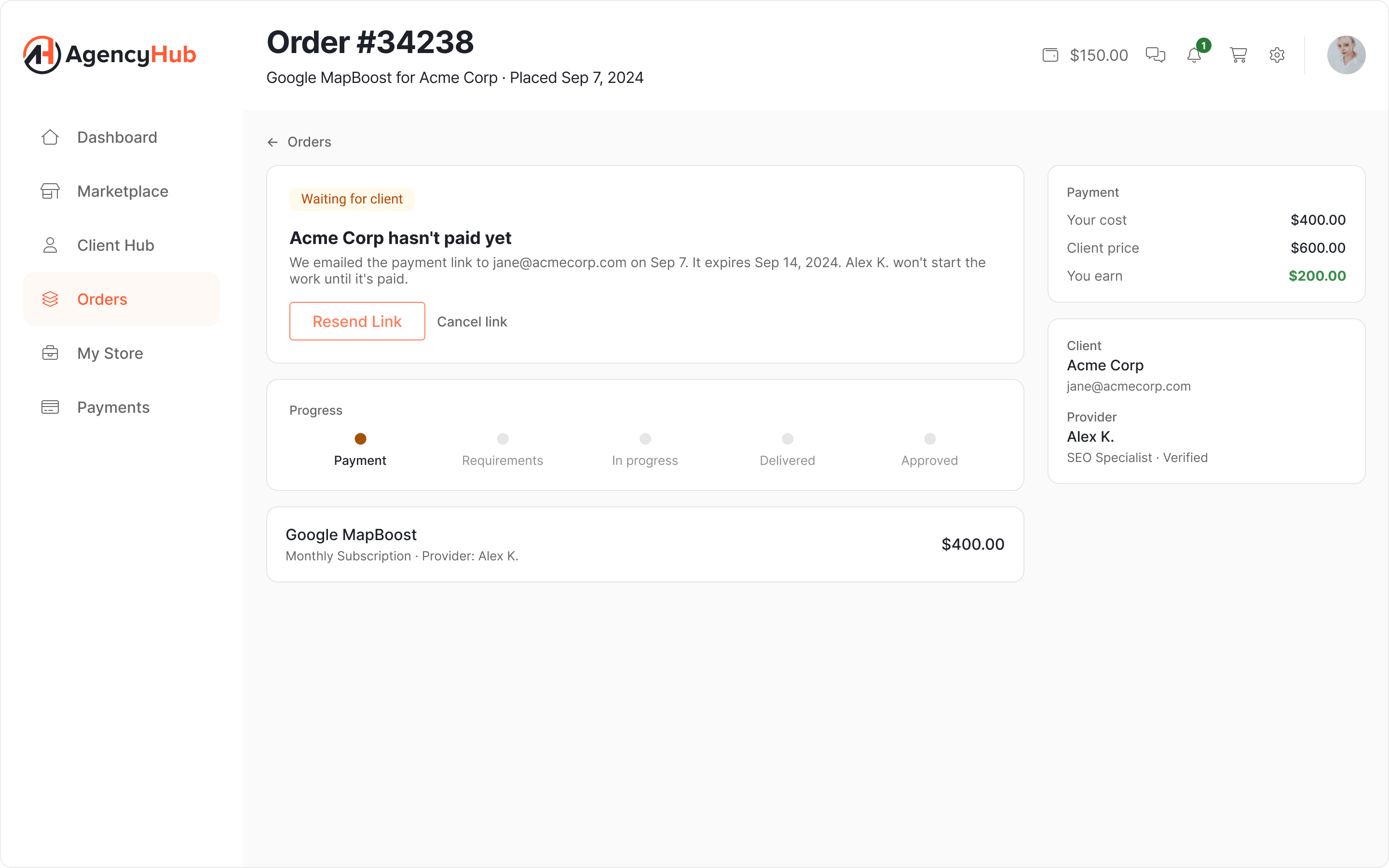
In a product where payment might never arrive, states are the product:
waiting for client: bought, unpaid, the provider cannot start- Payment link expired without payment
- Cart with no client assigned, checkout blocked with the reason written out
- Switching client with a full cart
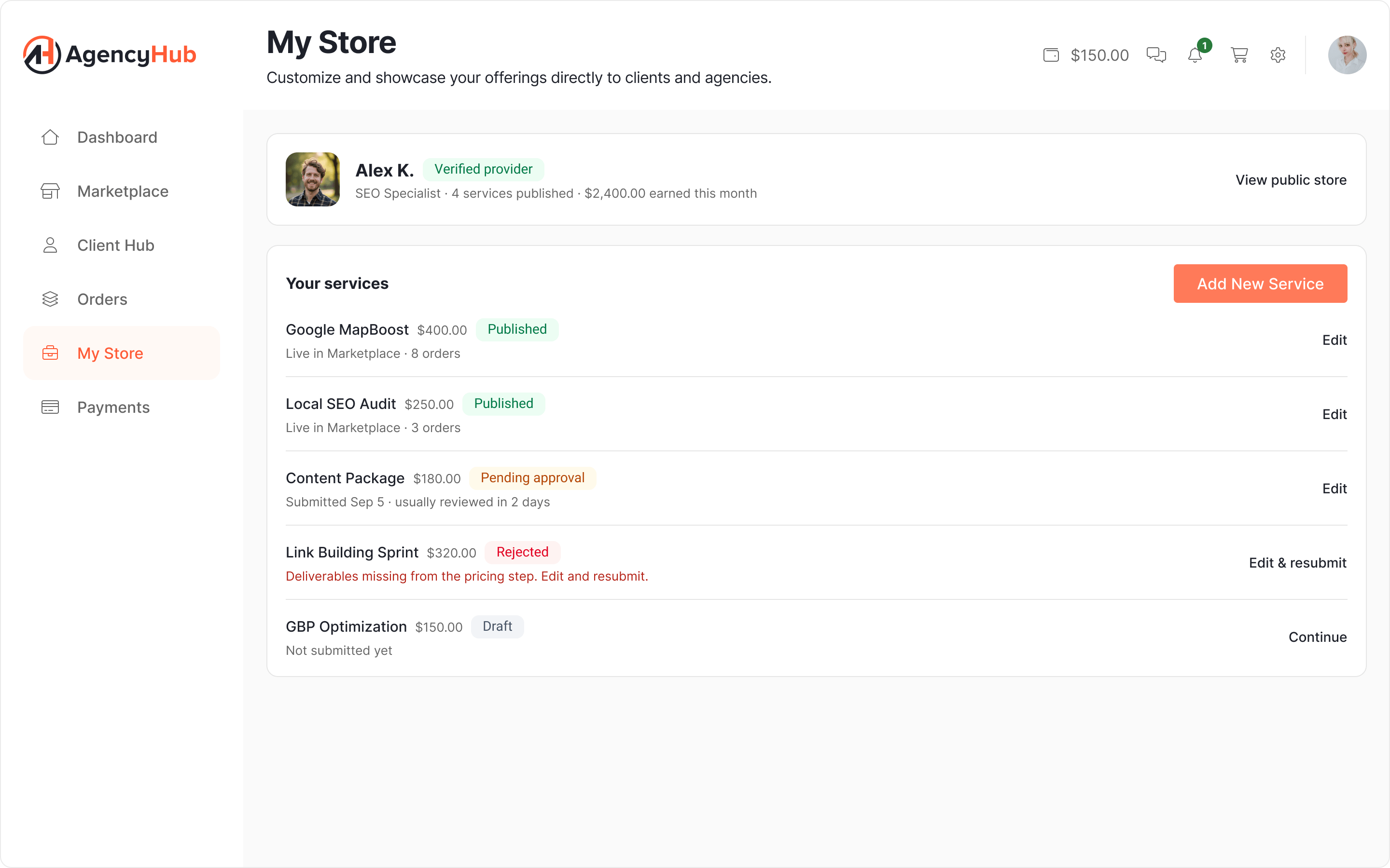
- Provider listings in draft, pending approval, published and rejected, with the rejection reason and a way back in
The System
One system behind every surface.
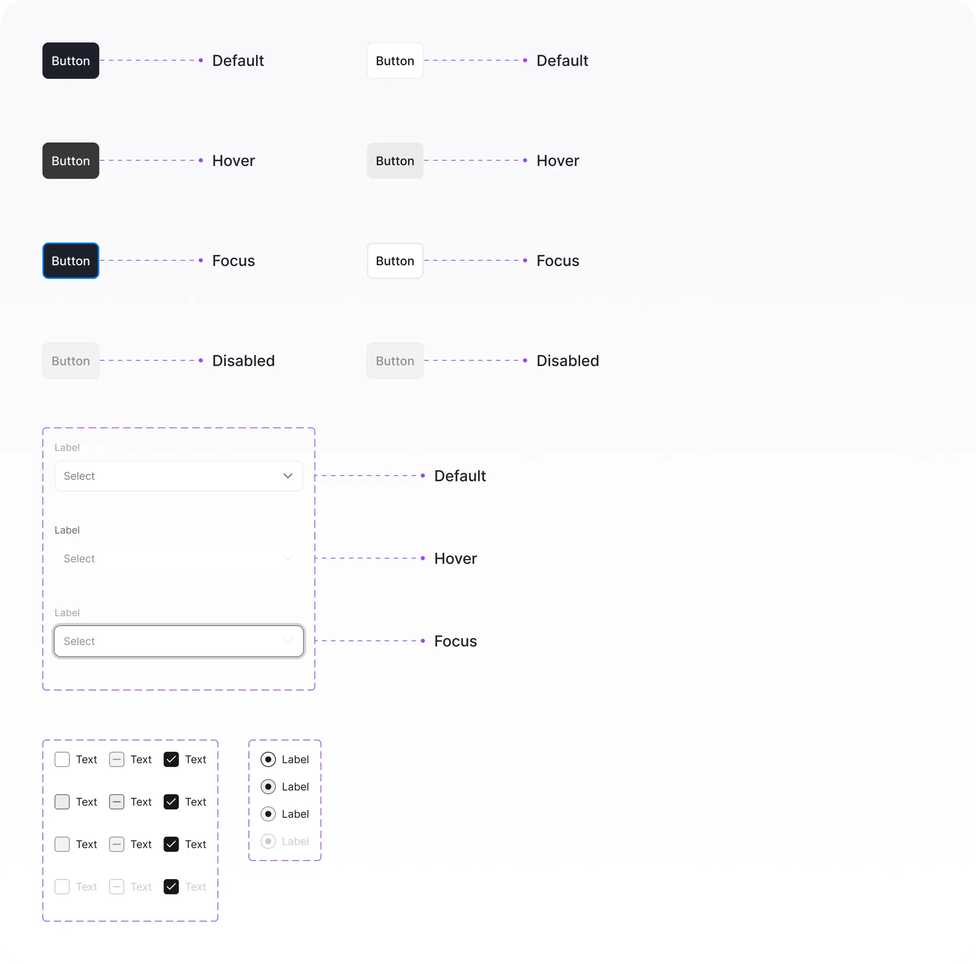
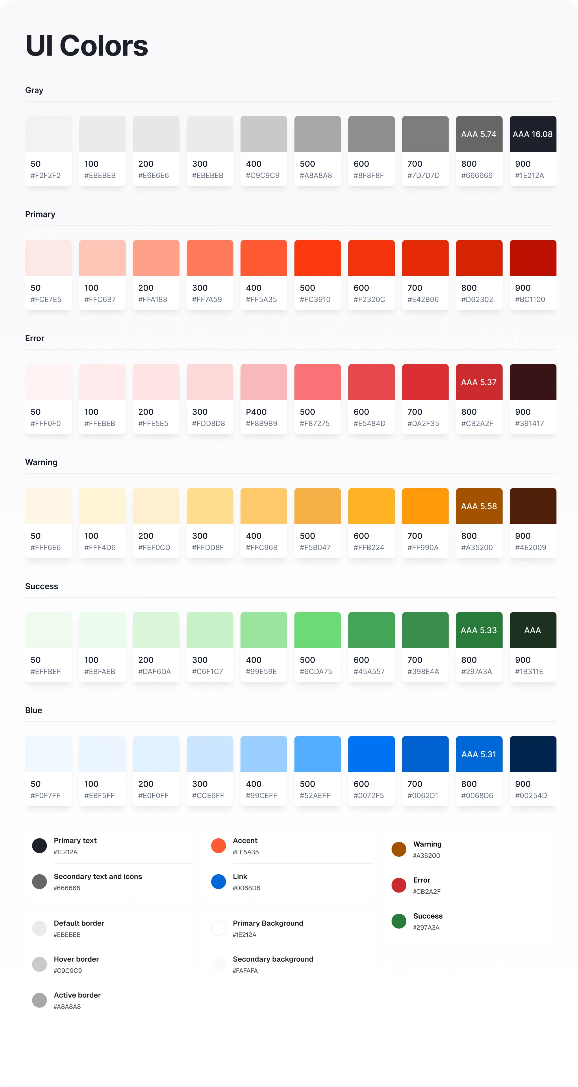
Marketplace, cart, orders, and the provider's store were built from one set of components and layout rules. For a solo designer this wasn't aesthetic discipline; it was the only way to ship four coherent surfaces at once.
The same system absorbed the project's odd states, like orders waiting on a client and listings waiting on approval, without inventing new patterns for each.
How: how do we know it worked?
A design isn't finished when it ships. It's finished when it's measured.
The honest version: I moved on before the metrics matured, so this section makes no claims I can't back. Instead, it shows what shipped and the instrumentation plan I'd use to judge it.
The design made a new behavior possible: an agency can sell a service it doesn't deliver, with payment, requirements, and fulfillment handled by the platform instead of spreadsheets and email.
Vetting moved from a private, per-agency struggle to a platform feature. The approval gate is the product's trust claim, enforced by design.
Four surfaces shipped from one component system, by one designer.
What I'd measure next
If I continued this work, I would instrument the two riskiest decisions: how many checkouts end in a payment link, which shows whether the third-party flow is real demand, and how long provider approval takes, because trust is only a feature if it doesn't strangle supply.
The Framework
The questions I carry into every project.
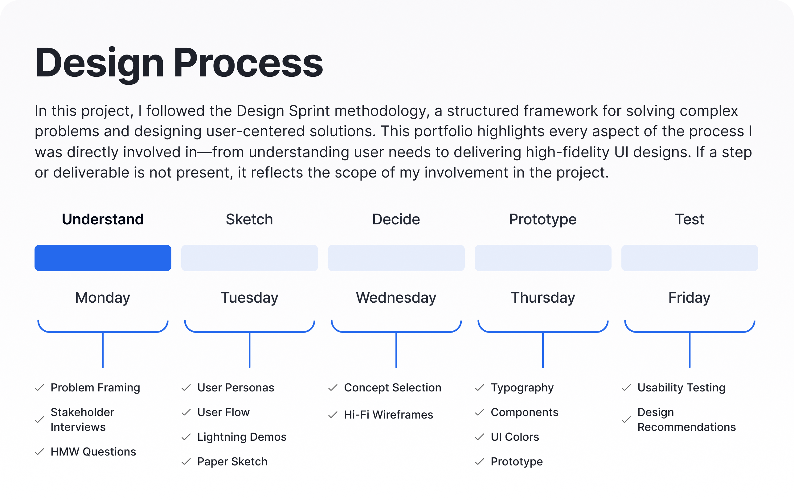
This process isn't specific to AgencyHub. It's a question sequence I apply to any product problem, because a repeatable process is what makes design judgment transferable between projects.
Why
Understand the goal.
- What problem are we trying to solve?
- How does this product benefit customers?
- What business opportunity does it create?
Who
Define the audience.
- Which groups have significantly different motivations for using this?
- What are their pain points and emotions?
- What is their high-level motivation for solving the problem?
When & Where
Map the context of use.
- Where does the product meet the user's day?
- What has to be true right before and right after each interaction?
What
List and prioritize ideas.
- What could we build to fulfill the customer's needs?
- What already exists, and why isn't it enough?
- Which idea has the best effort-to-impact ratio?
Solve
Make it concrete.
- What tasks must the customer complete to succeed?
- What do four fast sketches teach before high fidelity?
How
Measure success.
- How would we know the solution worked?
- Which metric would expose the riskiest assumption first?
Next project
InstallPros · U.S.